
Sean Michael Robinson:
Greetings Cerebites!
After polishing off Reads two weeks ago, I've been pounding away at the remaining work on the Church & State II restoration. Good news--I'll be done with the bulk of the work (excluding layout, essay, and any revisions) by the end of this week.
All of this cleanup work, especially the tone cleanup which takes up the bulk of the work time, gives me a strange kind of relationship to the artwork. Specifically, I get to see it up close. Really up close. Closer--so Gerhard told me--than it was ever intended to be seen.
Mostly, this leaves me with a greater admiration for the sheer sweat expended on these pages, the visual invention and flare, some of which never made it to the printed page.
I was interested to see Michael G's comment this week on the just-released Church & State I--
I hope we get to see some convincing updates on the progress on Vol. 2. In any case I can't wait to read it, and I hope that a quality printing of both volumes generates some newfound enthusiasm among Cerebites for these books because they're just as great to re-read as HS and Jaka's Story.
What better way to see the improvements than to take a look at one of my favorite issues with some direct comparisons?
Issue 89, "Dead Friends", is the third "Odd Transformation" story in the series so far. It's a dream sequence, and like the previous Odd Transformations stories, is visually stunning, but in a more subdued way than the previous installments, which relied on more dramatic cinematic techniques and double-page spreads/size of images to carry the visual weight. Instead, "Dead Friends" has a fairly static "camera," and it's the imagery itself, and the drawing and rendering itself, that is powerful and surreal.
Which makes me very happy that we have scans of all the original artwork for this issue!
Here's a scan of the lower right panel of page two, from a ninth-printing copy of the C & S II graphic novel, followed by a cleaned up version scanned from the original artwork.


This is a particularly dramatic example, as this page was replaced by a second-generation negative at some point in the print run of the book. Second generation negatives make up around 4 percent of the whole book previously.
On page 13 is another image that's made illegible in previous printings by fill-in in photography and dot gain in the printing. Bran and Weissapt/Thrunk fight in the Prime Minister's office while the tower grows around them. These dense dark areas, especially with fine lines or tone, can be difficult to keep "open" in print.


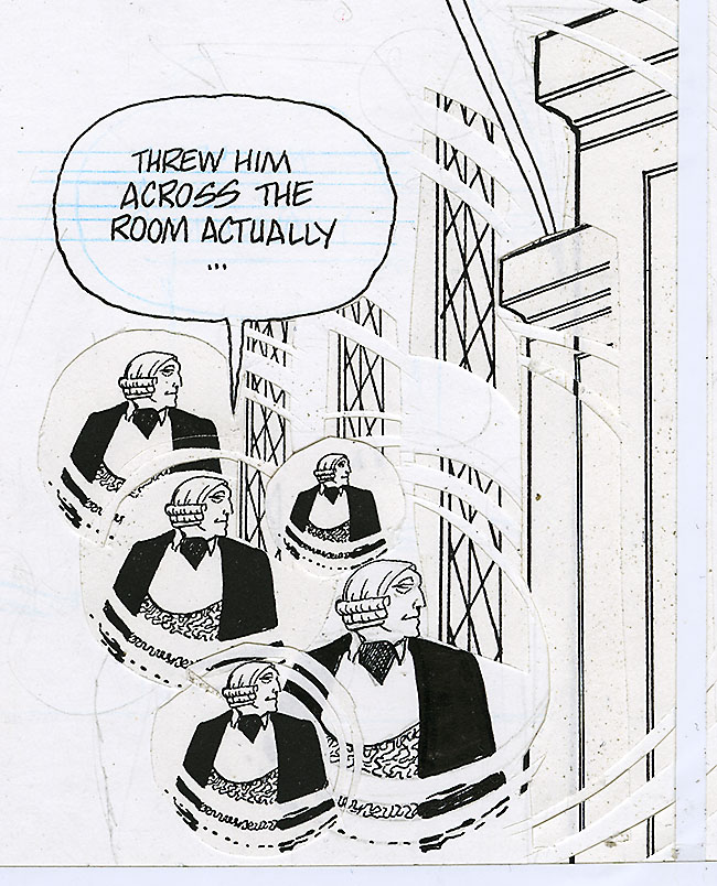
Page ten has some really inventive use of photocopies on the part of both Dave and Gerhard. I always wondered how they achieved this effect-- now, looking at the color scan, it's clear-- Gerhard photocopied the panel, cut arcs out of the photocopy, and then pasted down the remainder on top of the original drawing, leaving a sort of visual distortion/smearing effect across the architecture. (Am I mistaken in thinking the Weisshaupt figures are photocopy transfers, i.e. acetone rubbed on the back of a photocopy to transfer the image to the art board? notice the gray area of overlap)


The panel directly to the right has some similar work in both the figures and the background, with the repeated, size-varied figures standing in really well for the dizzy/seeing stars result of collision.
![]()
(This required a bit more cleanup than normal, as the raking light of a flatbed scanner tends to exaggerate paste-up/height differences in artwork, turning cuts in paper into visible lines)
Poor elf was suffering from second-generation neg syndrome as well. Here she is, renewed and rejuvenated.


Hope you enjoyed this peek under the hood. Next post we'll take a look at the original artwork, and some designs, for another favorite sequence of mine, "So."
Questions about the restoration work or the original artwork? Hit me up in the comments!
Questions about the restoration work or the original artwork? Hit me up in the comments!