Previously on 'A Moment Of Cerebus':
Dave Sim, working with George Peter Gatsis, has remastered the first two collected volumes of Cerebus to restore details and quality in the artwork lost over the thirty years since they were originally published (as detailed here and here). After Cerebus' original printer Preney Print closed its doors, Dave Sim moved his printing to Lebonfon in 2007 as at that time they were still capable of working with photographic negatives and making printing plates as Preney had done. And then Lebonfon switched to digital scanning and printing - a technology which struggles to faithfully reproduce Cerebus' tone without creating moire patterns (as detailed in Crisis On Infinite Pixels). Dave Sim continues to work with Lebonfon to ensure the print-quality of the new Cerebus and High Society editions (as detailed in Collections Stalled). Now read on... ![]() |
Cerebus Vol 1 & Cerebus Vol 2: High Society
Cover art by Dave Sim & Gerhard |
DAVE SIM:Checking in.
Working on page 22, the last page of THE STRANGE DEATH OF ALEX RAYMOND No.4. Still have to do the Notes section in the back, production notes for Chris Ryall and colouring notes for Jay Fotos. But...very close. Which brings up a key point -- I started the issue December 14 and I'm close to finishing it February 21. Which would lead your average person to say, "Okay, so it takes you two months to do an issue." Well, no. Even if I was done today it would be two months and one week. "Well, whatever." Well, no NOT whatever :). Over 18 issues, if I say I'm going to get them done in two months and it takes two months and a week, that adds FOUR MONTHS to the length of time it takes to do them. If that isn't factored in, the result would likely be 16 issues coming out on a monthly schedule and -- just as you were waiting for the Big Payoff -- suddenly you'd have to wait FOUR MONTHS for No.17.
Just sayin'.
This -- the Weekly Updates -- I think, is proving to be a successful experiment in Complete Transparency in running a business. Since I'm not a Computer Person or an Internet Person, I'm always thinking "What genuine use could you have for the Internet?"
It seems to me this is it, potentially. Everyone gets to read my "mail" before I do, so we all know what it is that I'm talking about when I come in to the coffee shop to weigh in.
Big plus (to me): genuinely interested readers and fans know exactly what's going on so anytime anyone wants to disparage Dave Sim as "crazy" and "evil" and wonder aloud what I'm doing right now, they can tell them. "Just go to A MOMENT OF CEREBUS and read the Weekly Updates. That will tell you all you want to know."
I think George and Sean are making REAL progress in
their discussions. Too technical for me in its particulars, but where it does intersect with my own areas of expertise:
1) I'm very aware of the differences between, say,
IDW's Artists Editions and 100% accurate reproduction of the INTENT of the artwork. i.e. Wally Wood didn't intend for you to see where he pasted up a correction or whited out and patch of brush work. Scott Dunbier makes interesting choices some places, opting to "go dark" a lot of times to pick up more of the paste-up/white out Reality of the original artwork.
Sandeep, by contrast, definitely did the bitmap conversion on glamourpuss.
My personal preference is for the latter.
[and for glossy paper -- I think the best reproduction so far -- apart from glamourpuss :) -- is the
Barry Windsor-Smith RED NAILS book which is on glossy paper. IDW prefers trying to match to the texture of the paper to the Strathmore art paper most guys used. But, that's apples and oranges to me. Guys didn't draw on glossy paper because it wouldn't take pencil very well, erase well, or hold up to man-handling. If the pencils just magically appeared on the page and could be inked without any further erasing, slick paper would be more precise. They were using fibrous art paper because it worked with pencil AND eraser AND ink and (often) tone. I did a revised Inside Front Cover for #3 on Strathmore paper and pasted it up on my usual 172 Illustration Board. I think I know why those guys liked the 3-ply Strathmore with kid finish so much :)]
This will be an interesting situation when each issue of THE STRANGE DEATH OF ALEX RAYMOND is (God willing) finally published as a black-and-white version and a colour version. My inclination would be to do the glamourpuss bitmap conversion method and cover up white-outs and paste-ups and things in the black-and-white version. But I'm doing it through IDW -- which has definitely showed a preference for the paste-up/white out Reality method. It should be something that Ted Adams, Chris Ryall and Scott Dunbier are happy with and fits in with their way of viewing comic art. It's THEIR money that's making it possible.
There are many things that George has picked up in his restorations (MANY things) --
[as an example, a trail of smoke from a candle being lit in #7 -- it was done in white paint and the white paint wasn't thick enough to make a definite trail. I never really got the hang of how to mix white paint so it was thick enough to be picked up by the camera but not so thick that you have to roll in between your fingers and stick it down by hand (just kidding).]
-- that I don't know if they would survive the conversion to bitmap. That's where I can't adjudicate the discussion. I would definitely opt for losing the pencil lines where they are being picked up where that doesn't compromise any linework that has been missing to now. I agree with Sean, it takes the reader out of the story -- particularly the guidelines for the lettering -- and the CEREBUS trades are, first and foremost, "popular editions". They're meant to be read. And where you err, you have to err on the side of "literary/visual" anywhere where you would be interfering with the READING experience. As long as you don't lose tiny lines that the "visual/literary" reader is entitled to. ALL THE WAY into the page and balancing between those two things -- I'd tend to leave it up to the guy doing the heavy lifting.
Photocopied panels, I'm in complete agreement. Kim Preney finally had to explain to me that photocopies only LOOK accurate and clean. They're actually formed by the toner powder adhering magnetically to the charged area. So the "thin line" is actually closer to a pattern formed by iron filings on a piece of paper over a magnet. When you shoot that with a camera, you're going to be shooting that "flare" of iron filings that aren't readily visible... and get a fuzzy image. Where that happens -- like Weisshaupt taking a drink early in CHURCH & STATE -- I'd suggest scanning the first panel which is the original and then matching the placement where the photocopies are)
Way, way, way off in the future -- if anyone is still interested in CEREBUS -- someone is going to face the choice of scanning Gerhard's original artwork for the bags of gold backgrounds (which are still in The Cerebus Archive) in CHURCH & STATE and digitally substitute them for the bags of gold photocopies on the original artwork, matching area to area.
How DEDICATED are you to restoration of INTENT? I sure wouldn't want to do it.
Watery ink, I'm still dealing with on a daily basis. I'm doing the thinnest lines I've ever done on the STRANGE DEATH pages and there does come a point where -- through evaporation -- the pen nib just won't do fine enough lines because the ink is too thick. This is particularly true when the pen nib is brand new (my solution to not being able to Master the Gillott 290 pen nib -- a brand new Hunt 102 is the same fineness of line but it requires changing nibs VERY frequently) and I'm trying to copy, say, Ray Burns lettering on a RIP KIRBY panel that is maybe 1/20th the size that HE lettered it at. So, I dilute the ink -- actually using distilled water which keeps mineral impurities out of the mix -- but then have to wonder: is IDW going to be able to pick this up? First of all on the black and white and second of all on the colour version? Which is a persuasive argument for their Reality Original method. You'll pick up a light brown letter that's supposed to be black that you're apt to lose when you're making everything Either Black or White.
Following on from the "heavy lifting" on CEREBUS restoration: Possible solution: George provides Sean with his finished digital files and Sean goes through them looking for instances where reproduction choices are, in his view, interfering with the reading experience. Then, the discussion could move over here with Sean saying: "Okay, here's what can be done. If I adjust the reproduction to lose the pencil lines on this page, THESE lines are going to fade. THIS is the tipping point. Here's "-1""-2""0""+1""+2". What say you, CEREBUS fans?"
Or CEREBUS fan -- since there will probably only be one person still reading at that point. :)
But, that to me would be the hidden benefit to running a Completely Transparent Business: the person who has the level of interest to stick with the discussion right to the end, IT GETS TO BE THEIR CALL! COOLNESS!
I'm sort of kidding I sort of think.
Travis P.: Thanks for
your comments. I don't want to make too much of a point of it, but I infer that anyone who hasn't signed the "
I Don't Believe Dave Sim Is a Misogynist" petition thinks I'm a misogynist and -- to me, compelled inference -- doesn't want the immaculate purity of their Feminist reality trodden upon by me. Particularly including requests for things like assistance, advice or comped books. It's all guesswork which is why I asked Margaret to start the petition. When
Rob Walton signed and
Chester Brown didn't, at that point I knew that there was NO WAY I could ever guess who thought I was a misogynist and who didn't. Same reason I wouldn't contact
Colleen Doran or
Eddie Campbell. You don't want to make a mistake in those cases. Or, I don't, anyway.
Speaking of which, the Petition has 20 EXTRA NAMES since, like two weeks ago. WHAAAAT??!!
The best jump we ever had in the last six years was when Oliver's significant other Carma Chan decided she was, single-handedly, going to get the 2,000 signatures. Which I knew she wouldn't. But I think she got something like 12 in the space of a month or so. Which was INCREDIBLE!
Not sure what's going on.
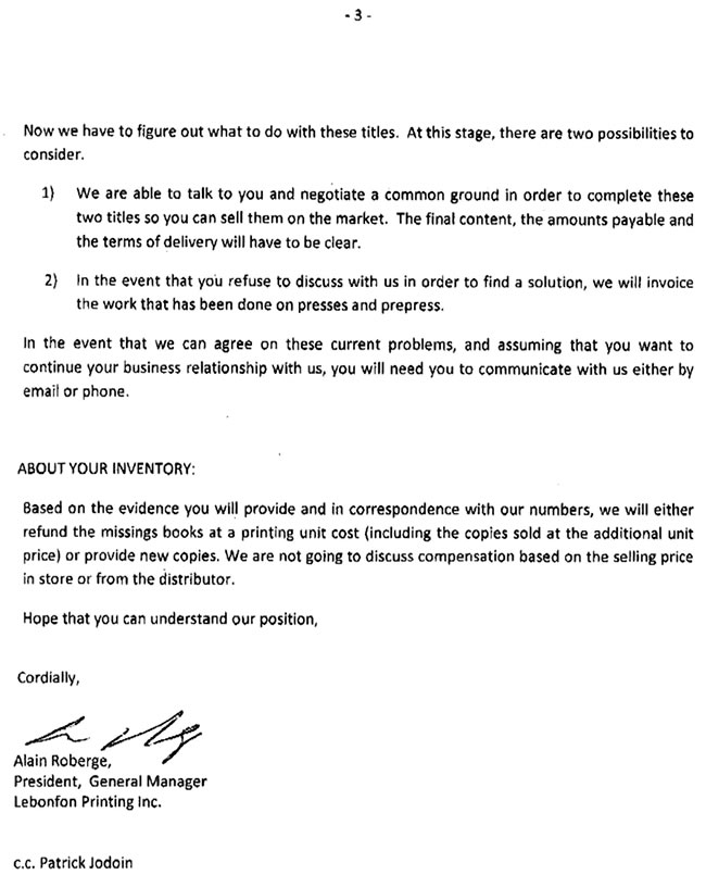
Okay, still waiting for a response from Lebonfon both here -- Monsieur Auberge pere ou fils (turns out that the General Manager is the son of the President: very reassuring that Lebonfon is a family operation: so it's not as if internal communication is going to be a problem) or Patrick or Josee -- and also a quote as to what they are going to charge to do a test signature of George and Sean's (at the moment theoretical) final fixes.
They're probably just mulling over what George and Sean are talking about.
See you all next week!
Originally serialised within the pages of the self-published Glamourpuss #1-26 (April 2008 to July 2012), The Strange Death Of Alex Raymond is an as yet uncompleted work-in-progress in which Dave Sim investigates the history of photorealism in comics and specifically focuses on the work of comic-strip artist Alex Raymond and the circumstances of his death on 6 September 1956 at the wheel of fellow artist Stan Drake's Corvette at the age of 46.