Quantcast
Channel: A MOMENT OF CEREBUS
Viewing all 5201 articles
Browse latest View live

Weekly Update #42: A Postal Beatdown!

$
0
0
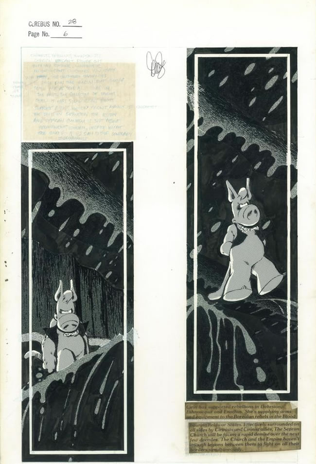
Cerebus Archive Number Two
Original Art, Cerebus #28 Page 2

DAVE SIM:
EXECUTIVE SUMMARY
  1. CEREBUS Volume One, 16th printing has arrived! George Gatsis declares: "This COULD be the Legacy edition".
  2. CEREBUS ARCHIVE NUMBER ONE is that much closer to shipping.  I've finished the last of the signatures (on the fully inked Cerebus head and ballpoint Cerebus head ones).  All that's left is final design of the shipping package.  John Funk has done three prototypes.
  3. Scanning of the ten earliest HIGH SOCIETY pages in the Cerebus Archive has been accomplished for CEREBUS ARCHIVE NUMBER TWO.  Next step is to do the video and write the commentaries on the pages.
  4. CEREBUS ARCHIVE NUMBER TWO to feature Bonus Prints as per Mike Kitchen and John Funk's suggestion (among the Bonus Prints available for purchase will be: the LOCK & KEY variant cover,  the glamourpuss #1 Zombie cover, Cerebus Archive Zombie covers #1, #2 and #3, the five STRANGE DEATH OF ALEX RAYMOND covers, the full X-FILES variant cover of which IDW only used the bottom portion -- along with my original script and cover letter to Chris Ryall).

1.  George Gatsis' fax of 29 July reads in its entirety:  "I have reviewed the sample completed copy of Volume One and...very nice. And...I showed it to many people at my office, pros and novices...and asked them to point out which pages are bitmapped and which are greyscale...And they couldn't answer.  To a layman...this COULD be the Legacy Edition...No more work required. That's it on my thinking on this book." 

Arguably, George makes a very good point.  However, I'm reminded of the old ad slogan --  "an educated consumer is our best customer" -- which I think very much applies here.  I was very impressed with the book, particularly with the work that George did on the white-on-black lettering and restoring the lettering in the last couple of pages of "Swords Against Imesh".  THIS time around, readability was Job One and I think I can safely say that this is the most readable version of the CEREBUS volume, EVER.  At no point should you be taken out of the narrative by hard to read lettering.

I'm also impressed with the very advanced work that Sean brought to bear on issue 1 and issue 6.  There is definitely more detail there -- sharper detail and extensive detail -- than has appeared in any edition of the CEREBUS trade.  I'm ALMOST at the point of admitting that my early CEREBUS work doesn't suck nearly as badly as I've thought it has for the last couple of decades.

ALMOST :).

Sean has finished his grand tour of his work on the book -- profusely illustrated -- and we're just waiting for word that the CEREBUS trade has made it into the hands of a comic store (Menachem? Trent? We're counting on you!) and then into the hands of a purchaser.  A week after we have confirmation, we'll let all of you know that you can now get the book and leave time for the book to make it from Diamond to your local store and THEN I'll give Sean the "high sign" to post his tour and we can all "have at it".

It's probably best explained this way:  This IS the Legacy Edition, but it's not the ULTIMATE Legacy Edition.  The ULTIMATE Legacy edition can't be declared until Sean has learned everything there is to learn about restoration and EVERY page of art from the first 25 issues has been found, scanned and tweaked.  Is that EVER going to happen?  Mm. Probably not. But, I think I'm safe in saying that none of us are quitting until it HAS happened.

So, I hope all of you will enjoy the best of both worlds:  1) purchasing the BEST version of the CEREBUS trade ever to be brought to market and 2) following along as we all work to refine and improve what we're doing.


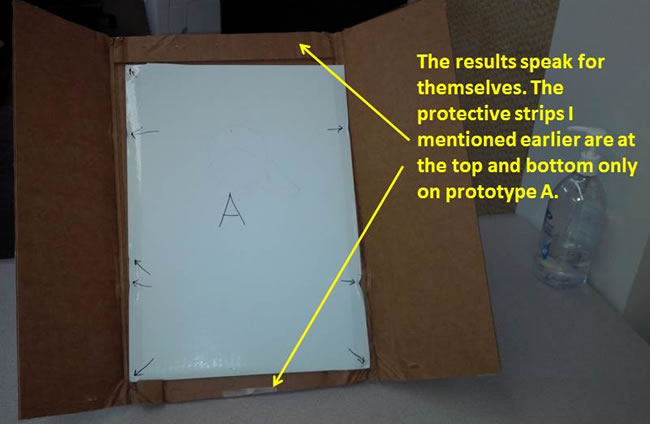
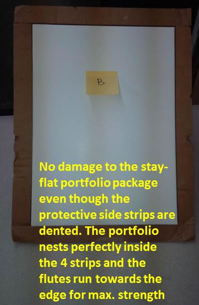
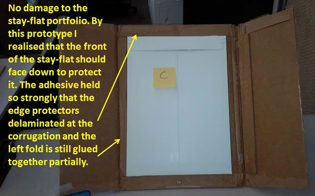
2)  This post should include John Funk's three prototypes for the CEREBUS ARCHIVE NUMBER ONE shipping [see below]. Contrary to what I said before, the CANO that we shipped to Eddie Khanna did not come in in perfect mint condition. There was a small dent on one side of the CEREBUS ARCHIVE NUMBER ONE. Nothing major, and it might very well be an exceptional circumstance. But we're not relying on that.  Instead, we've jettisoned the idea of a bubble mailer in favour of extra cardboard all the way around.  Basically using the Amazon theory:  heavy staples and "redundant" cardboard as natural insulation and "buffer".  MY preference is for version B which I actually dropped -- corner on -- from the top of the stairs onto the hardwood floor in the entryway.  There was a mark but it was barely noticeable from that height.  I think any one of the three packaging forms will work.  And, of course, we are assuring everyone that if there is ANY damage, they can return their copy for a replacement.  The damaged copy will be destroyed, but you'll retain "your number" and get exactly the package that was already sent to you.  No difference. No replacement charge.

Coupled with the fact that MOST CEREBUS fans aren't usually "mint freaks", we can afford to cater to those who are and guarantee that everyone gets exactly what they ordered.

On the question regarding "Club 261" -- of the 16 people not included, most are people who donated $2 or so.  It would literally cost more to send them a membership card in the mail than they donated in the case of international orders.

If, however, you are one of the people who didn't order the actual CEREBUS ARCHIVE NUMBER ONE, but did order, for example, the bookplates, just let John know and I will make up an individual membership card for you and mail it to your personally.

I'd also like to personally apologize to Michael R who is one of our "birthday pledge partners" from the last day who pledged on the understanding that he would get an update from me on his birthday on what I was working on on THE STRANGE DEATH OF ALEX RAYMOND that day.  As I wrote to him, it's a "bad news" -- I forgot your birthday (July 20) -- and "good news" deal: instead of just getting a copy of the page I was working on that day, you get one of the actual tracing paper transfer images that I was using to make that page.  I mailed Tim M his birthday scan of the page I was working on (July 30) and I'm all set to send one to David M (3 August) and Andrew L (Aug 23).

Hopefully we'll have this all nailed down in the next couple of weeks and there will be NO MORE FORGOTTEN BIRTHDAYS (not by us anyway).  


3. I've gotten the earliest ten pages of HIGH SOCIETY scanned in preparation for launching the CEREBUS ARCHIVE NUMBER TWO Kickstarter campaign.

I asked John to post the scan of CEREBUS No.28 page No.6 to Tim and Tim to post it here to show you one of the decisions that I've already made:  As you can see the "stats" of the typesetting are very badly corroded (this results from the stat not having been cleaned properly after it had developed -- the developing chemicals stayed on it and eventually pretty much ate it alive).  Another stat is missing.  Coincidentally, Sean -- we he got them -- said how much he liked seeing the handwritten text written in blue pencil visible through the yellowed adhesive.

"Hey, you know what?" I thought.  "I bet these stats are so badly rotted that they're just about ready to let go.  Why don't I peel them up and reveal all of the blue pencil hand-lettering?" So that's what we're going to do.  Means having to have the pages re-shot, but that's kind of a no-brainer, I think. 


 4.  I'm going to be trying the Bonus Print idea suggested by Mike Kitchen and seconded by John Funk on CEREBUS ARCHIVE NUMBER TWO.

Not REALLY sure how it's going to work specifically yet but theoretically what I want to do is to use it to hopefully keep the revenue up even if we lose a bunch of people who are just not in the "solvency" situation of being able to support us on a quarterly basis.

Basically, we start with the idea that everyone can order a Bonus Print for an extra, say, $15.

But JUST one.

That's if we can generate, say, $10,000 over 30 days.  If we go past say $20K then everyone can order two prints and instead of paying $15 each, you pay $12 each.  And if we hit $30K as we did last time, then you can order as many of the Bonus Prints as you want for the $8 each you're already paying for the HIGH SOCIETY pages.

That's not carved in stone, so feel free to offer suggestions and criticism.  Just remember that the idea is to generate as much money as possible so we're able to keep moving forward on the restoration and preservation of all 16 volumes.

I'm even thinking of some NON-print Bonus Items you can opt for:  like (for instance) a complete set of COMIC ART NEWS & REVIEWS on disk or COLLECTED LETTERS 3 on disk or the complete glamourpuss on disk.

ANYthing to keep Sean and Dr. Mara burrowing through those 6,000 pages. 


Answering some questions from last week:

a) On the subject of pencil sharpeners, I'm pretty sure that the High Volume X-acto model is the one that I've gotten.  It still sharpens pencils, it just doesn't sharpen them NEEDLE sharp, which is what I need, particularly for tiny, tiny photorealism drawings.  Neal Adams and Al Williamson are about the best at it -- to me, it's what separates the Top Rank guys from the second stringers -- which is doing figures that are an inch high and getting all the same detail (facial features, tiny pen lines defining the curve of the cheek, etc.) into a figure an inch high that they do into a figure that's standard size.  In fact I just intentionally did two or three pages of "Dave as narrator" with me only an inch high in the panel just to get some practice at it.  They came out pretty good but nowhere near Adams or Williamson level.  And part of that is my inability to get a pencil sharp enough -- NEEDLE sharp -- even using the pencil sharpener, AND an X-acto knife AND coarse sandpaper.

I'm going to see about getting replacement blades for the sharpener that I have but I don't think Staples carries the blades separately.

I have tried mechanical pencils but, again, the problem isn't the pencil, it's the sharpener.  The one that they supply with the pencil and pencil leads just sharpens to typical pencil sharpness.  Sharp but not NEEDLE sharp.

The best I've been able to do to date has been the combination pencil sharpener, then whittling with an X-acto knife (whittling the point of the lead, not the wood), then maintaining the resulting NEEDLE sharpness with the sandpaper after every two or three tiny little pencil lines.

It's educational, I must say!  Torturing yourself doing figures an inch high makes inking normal sized faces and figures nearly effortless.  I wonder if that's how Adams and Williamson got that good?

b)  Hi Jake!  Thanks for your inquiry!  The Winsor & Newton brushes are SERIES 7, number 2 sable brushes.  The series 7 brush comes in a variety of sizes from #1 up to #9 (I believe).  Raymond used a number 2, Stan Drake used a number 3 -- both series 7

c)  Paul Slade:  on the Legacy printing:  See above!

Back next week with another Update!   


Packging Prototypes:

Taking A Beating:
(Click image to enlarge)

Surveying The Damage:


From The Archive: Michael Zulli's Puma Blues

$
0
0
Puma Blues / Cerebus Crossover
Art by Michael Zulli
DAVE SIM:
Treasures of The Cerebus Archive -- This is a piece that hangs in the Off-White House Liberry. I always spell it that way. I remember having an English teacher in grade six (I think it was) who referred to the Liberry. She did that a few times and I was thinking, "I thought it was LiBRARy". And then she did it in front of another teacher and said. "My God -- they've got me pronouncing it that way, now." 

Cerebus False Starts: Rick's Story

$
0
0
DAVE SIM:
When you're keeping a monthly comic book on schedule, there really isn't an opportunity to "redo" pages. On the other hand, if you have serious doubts, there is a window of opportunity to change your mind. Sometimes the window was a little wider than it was at other times:

RICK'S STORY page 164 -- Too comedic. Having developed this really ominous tone over the previous two pages I was in danger of frittering it away. As you can see it took me a while to figure that out.

George Peter Gatsis: Scanning Guide

$
0
0
Tim,
Maybe you could make something out of this and post it on AMOC? This is the education I emailed to John Funk and Sean, for getting the detail in the darks and lights to co-exist in one digital page... This is what I did for the 1000 plus pages of Cerebus v1 and v2.
George

Cerebus #79 (October 1985)
Art by Dave Sim & Gerhard

---------- Forwarded message ----------
From: George Peter Gatsis
Date: Fri, Jul 11, 2014 at 2:04 PM
Subject: the steps...
To: Sean Michael Robinson

Sean,
I'll use the following screen snapshots to illustrate my process in detail.

[Click images to enlarge]


This is the area I will be using to illustrate the process


1_raw_and_JF_adjusted.png
This is to show a side by side comparison of the raw 2400 dpi and standard overall adjusted 2400 dpi.
Notice the detail is missing in the adjusted.


2_GPG_adjusted_and_JF_adjusted.png
Here I have adjusted the raw scan with the LEVELs window floating, so you can see the manual adjustment that I made... with a comparison of the standard scan below.

Notice in my adjustment that the details in the white have swelled up... THIS IS IMPORTANT, the greater the detail we can get from the white areas that are surrounded by a sea of black will go a long way of maintaining a good print when the ink swells into the white area.

IF THIS PAGE was more white covered, than black, as it is now... the adjustment points would be shifted slightly to the right, somewhere between where it is now and the middle.


3_GPG_and+JF.png
A larger area for a side to side comparison.
Notice the detail that I have maintained and the detail that the standard adjustment has lost.


4_JFs.png
A close up of standard adjustment


5_GPGs.png
A close up of my adjustment.
Notice the more detail.


6_GPGs.png
A close up of my adjustment.
Notice the less detail in the white areas around the lamp glow.


7_JFs.png
A close up of standard adjustment. 
Notice the less detail in the dark areas in the bottom right.


8_best_of_both_worlds.png
Overlaid standard adjustment and mine.
I only exposed or kept the detail of standard adjustment around the lamps glow area and the rest of the areas around are my adjustment. So we get the detail in the dark areas and in the light areas.

9_JFs.png
Notice the lack of detail all over this standard adjustment. BUT in the light area, at the base of Cerebus neck you'll notice 3 horizontal lines.


10_GPGs.png
My adjustment has all the detail in the dark areas, BUT lost the detail in the light area, which is at the base of Cerebus neck - the 3 horizontal lines.


11_best_of_both_worlds.png
So, I've kept all the detail of my adjustment, which maintained detail in the dark areas and brought in the detail of the standard adjustment to keep the line detail at the base of the neck.

So in conclusion, it is a VERY manual process, marrying the best of both worlds DARKS and LIGHTS. Rarely one level adjustment works.... Most of the time you would have to:
  1. Take the raw scan
  2. Keep the source file on the base layer
  3. Duplicate the base layer twice
  4. Make your dark adjustments on layer 1... which you DODGE the dark areas to make the detail more pronounced for printing... so when the ink swells it won't fill in.
  5. Make your light adjustment on layer 2... which you BURN the light lines to make them thicker, so they won't break or disappear in printing.
  6. MASK layer 2
  7. And then expose only the light area details in layer 2 over layer 1
  8. Once you have the best of both worlds for layer 1 and 2...
  9. Group layer 1 and 2 into a folder and then flip it on and off to see what may have been missed or lost.
  10. Then if everything is good...
  11. Save PSD file
  12. Then flatten and SAVE a JPG file
  13. DONE.
Now do this 1000 plus times for Church & State 1 and 2... DONE!

THANK YOU TORONTO! ELVIS HAS LEFT THE BUILDING!!!

AND... I recommend:

  1. RGB scanning
  2. Sticking with 1200 dpi... or 2400 if you can deal with it.
  3. Scan in everything RAW unadjusted
  4. Make a back up of the raw scans that are scanned every day to the CLOUD STORAGE and a local hard drive
  5. Go with the 13 steps above.
Cool?
 

Chive on,

George Peter Gatsis
CEO / Executive Producer
The Black Diamond Effect Inc.
2200 Gerrard Street East,
Toronto, Ontario, M4E 2C7
T 416-440-4031
F 206-309-0055
www.tbdeinc.com

www.georgepetergatsis.com

From The Archive: Neil Gaiman's American Gods

$
0
0
DAVE SIM:
Treasures of the Cerebus Archive -- AMERICAN GODS first printing, personalized by Neil Gaiman:
For Dave Sim, - who has probably been wondering what I've been doing with myself -- and who still sends me Cerebus, month after month, and amuses, amazes, delights and infuriates me in equal measure -- a small book, that might have been improved with pictures, about gods (but not about God) -- in the hopes that you'll find something to enjoy in these pages
Neil Gaiman
30 May 2001
Neil had originally declined my offer of a comp subscription because he felt that picking up CEREBUS in his local comic store was a big part of the CEREBUS experience. His local store started missing getting issues for his subscription file and (stop me if you've heard this one before) weren't able to get them for him. So he decided that a comp subscription was now necessary.

What I don't get -- or even "get" -- to this day is how a piece of writing can "infuriate" anyone. There are things that I read that I agree with and there are things that I read that I don't agree with but I can't think of anything that I've read that has infuriated me.

May 2001. Seems significant to me that the flyleaf synopsis begins "The storm was coming…"

Strange Death Of Alex Raymond: Art Auction!

$
0
0


Glamourpuss #14, Page 12 (July 2010)
DAVE FISHER:
As mentioned last month, I've been trawling through the Glamourpuss Archives and pulling items of interest and finally posted the first $1 (opening bid) auction at eBay -- the tracing paper & assorted "stuff" for Glamourpuss #14 page 12.

It's raining outside. Alex Raymond removes his jacket and shakes off the water. He's minutes away from meeting Stan Drake. The hand of death is with him as he presses the elevator button. It gives me chills just thinking about it!

Of particular note in this lot of "stuff" is the pair of "practice tees." Dave Sim explains:

"Quick pencil the basic drawing...
"Study Alex Raymond inked strips...
"Thick brush strokes using brush pen to imitate the Winsor & Newton Series 7 Brush...
"Then - medium marker to lay in the stripes on the shirt...
"Then - Actual Hunt 102 for the tiny lines on the face...
"At that point I have all the right densities, can flip it over on the light table and do a finished pencil tracing, and fixing any distortions, leaning angles, etc."

Sim has signed those two pieces. He'll sign the tracing paper with "Signature Options" to request.

BONUS: If we get any value on this auction (*cough*) the successful bidder will get a copy of the comic-book sized Glamourpuss Art Auctions Catalogue autographed by Sim when we get there in 2014? ...2015? ...2016...? ... Place your bets!

eBay Auction ends Sunday, August 10th (GMT midnight / 7pm ET / 4pm PT)

Dave Sim's Notebooks: Selling Insurance

$
0
0
MARGARET LISS:
Along with notes for Cerebus #63, I found notes for some of the first stories that Dave worked with Gerhard on: the Epic stories. On page 57 of notebook 7 there is a sketch of young Cerebus with his hat, and a couple of title ideas "A Little Protection", "Down and Out in Iest and Beduin", and "Protector of his Neighbourhood".

On page 58 we see two small page layouts for the story still entitled "Protector of his Neighbourhood". Two pages, someone going down some stairs with something bumping down the stairs behind him. The second page of layouts was never used.

Notebook 4, page 58

On page 60 of notebook #4, we see that Dave is still thinking over the title for the story with a couple of the same ones from before along with "Making Ends Meet" and "Selling Insurance".

Notebook 4, page 60

On that same page we see a sketch for the first page of "The Protector of His Neighbourhood" (or is it "A Little Protection"?) and a sketch for the 2nd page of the story. Other than the sketch having Cerebus holding the rope over his right shoulder instead of his left shoulder, it is the same layouts as page one from the story, and pretty close to the first page of layouts on page 58.

Then on the very next page we see a couple different layouts for page 2 of the story, which appears to now be called "Selling Insurance", with the tagline "By Dave n' Ger".

Notebook 4, page 61

Both layouts have the final page in them - the three panels on the bottom right of the top layout and the three panels on the right in the bottom layout.

And if you look close enough at the text that was crossed out? "Anything done for the first time unleashes a demon."

Margaret Liss is The Cerebus Fan Girl and maintains the Cerebus Wiki.

Cerebus Scan Brigade- Assemble!

$
0
0
Sean and Dr. Mara:


Friends! Cerebus Scan Brigade!

We are in the middle of an assessment of assets for the ongoing Cerebus and High Society restorations. For pages where we have neither original art nor quality negative scans, we're sourcing pages from Dave's file copies, of which we currently have access to the first 25 issues.

From time to time we'll be putting out an all-call message to any Cerebus fans out there with original issues. Do YOU have the best printed edition out there of various pages? Take a look at your copies and let us know!

So! We're currently hunting for quality 1200 ppi color scans of the following pages. These pages, as they exist in our file copies, either have significantly degraded/weak black coverage (flaky, milky or otherwise flawed black ink in the large black areas), OR have a double impression from the printing plate (resulting in a "blurry" image, with visible after-image or "shadow" around each line.)

Here's an example of weak black coverage. No, that's not a snowstorm in Theresa's hair.


This is an example of a bad "blurry" page, where the printing plate slipped during the impression:


If you have nice, crisp-looking pages of any of the following, please, if you're willing, email us a sample scan at Cerebusarthunt at Gmail. No need to scan the whole page until we see it-- just a single panel is fine. For your assistance, you will have our undying gratitude, and you'll be thanked in the resulting books along with everyone else who has helped so far.

Thanks again so much to everyone who's helped with any stage of this restoration! I've been tearing through High Society this week and I think it's safe to say, the book is going to be amazing. I can't wait to share more with you all as things develop.

We are seeking non-damaged scans of the following pages. How are your copies?


IssuePage
22
4
22
13
22
15
22
16
23
6

23
7
23
9
23
15
23
19

24
3
24
5
24
8
24
11
24
13
24
14
24
16
24
17
24
18
24
19
24
20

25
2
25
5
25
8
25
11
25
13


Weekly Update #43: Options Moving Forward

$
0
0
Cerebus Vol 1: Remastered 16th Edition (2014)
by Dave Sim
Restoration by George Peter Gatsis & Sean Michael Robinson
Diamond Reorder Code: STAR00070
DAVE SIM:
Executive Summary
  1. 16th printing of CEREBUS features some additional material: before and after scans of George Gatsis' restorations and a list of people who supplied original artwork for scanning
  2. Two-to-three week delay on answering mail and returning phone messages... hopefully temporary!
  3. Lots of options on the table for moving forward with HIGH SOCIETY and CHURCH & STATE scanning. Option A $40,000; Option B $6,000 - $9,000; Option C $250
  4. What IS the time-frame goal for getting HIGH SOCIETY done? Not as simple a question as it appears on the surface

Hello, everyone!

1.  Looks like we're still waiting for the 16th printing of CEREBUS to make its way through the Diamond Star System and actually into stores -- and into fan's hands -- that have ordered a copy.

Note to Tim Phillips from the Comments section last week: There isn't a LOT that's different on the 16th printing.  There is a list of the pages that were discovered and scanned in time to be included in the book -- and crediting each person that found them! -- but it's really only "to date" when George Gatsis was doing the major exclusive search and initial restorations.

(On my list of "to do" things -- which is getting longer and longer -- is a "Dragnet" certificate for anyone who found us a page with the page reproduced and my version of Cerebus as Jack Webb as Sgt. Joe Friday and the "714" badge. You'll see it here at AMOC first!)

There's also a few pages devoted to George's restorations themselves with before and after pictures. Nowhere NEAR as elaborate as what you've been getting here week after week at AMOC, but a good ABC starter for the casual buyer.

When we have confirmation that the book has arrived in the hands of CEREBUS fans, I'll be asking Sean to post his self-critique of the work thus far (which he's evidently been adding to in the interim) and then we can have a fairly wide-ranging discussion on how we're doing, where we're going and how we THINK we're going to get there.


2. I'm really getting swamped keeping up with everything so there's now a two-to-three week delay on answering mail and returning phone messages. Sincere apologies. I will be getting to everyone, I just need to prioritize right now in order to keep everything chugging along.

Interesting message from a comic artist (whose name was garbled on the tape) where he cites me as his primary influence in getting into the business and added that he figured I was "the most hated and secretly admired person on the Indy comics scene -- and I can only hope to achieve that same goal some day." It's an interesting theory -- the "secretly admired" part.  The "I don't believe Dave Sim is a misogynist" petition has flat-lined.  The last three signatories were, respectively, 2 weeks ago, 4 weeks ago and 2 months ago.

It certainly COULD be a sign of feminist power waxing and waning. And at the moment W!A!X!I!N!G!

That is, people going from secretly admiring me to having to REALLY SECRETLY admire me (Dave who? I don't know who you're talking about) when the perceived threat level of being crushed beyond recognition by feminists is at its peak.

I'm not really a participant in society as constituted, so I'd be guessing.

Waxing OR waning, it doesn't really affect me.  Feminism has obvious flaws that I've outlined and no one has been able to refute. Whether they're able to destroy me and my reputation completely now or in the foreseeable or distant future or long after I'm dead, to me, doesn't affect the central issue: identifying Reality and sticking with that.

I've got your number and I will be giving you a call. Good luck with "achieving that same goal". Just stick with what you believe to be true and let the chips fall where they may. 


3. Lots of faxes flying back and forth between me and Sean Robinson as we try to establish the best way forward. In answer to my (revived) suggestion about maybe trying to go with straight photography -- get a high resolution camera and use it to photograph the Dave Sim File Copies, Sean wrote:
"It's an excellent thought. When I dug into the topic two months ago, there were only one or two Hasselblad large-format camera digital backs that would us the res we need, and they start at $40,000 and go up from there.  Briefly considered renting one from a camera store in L.A. -- then I got the price quote and damage deposit [quote]"
Off the top of my head: a) how much of that is "L.A." where pretty much everything photography related is going to be overpriced? b) If it's $40,000 (and up) in 2014, what are the odds that you'll be able to do the same thing with a $50 cellphone in another five years?  That's always going to be in the back of my mind:  cost coming down exponentially and how NECESSARY is it that the trades be back in print RIGHT NOW? Seems a good reason to limit our work to HIGH SOCIETY right now instead of getting TOO far ahead on all 6,000 pages.  I go back and forth on thinking that, however.

The other thing we've been discussing is "scanning speed" because that's a primary variable.  If you're scanning 3,800 pages of artwork and/or 6,000 pages of Dave Sim File Copies at high resolution IS there a way to cut down on the labour costs by getting a faster scanner?  To which Sean replied:
"I took the speed thing and ran with it, looking for the fastest possible flatbed scanner. Fast in every respect including not having to fuss with settings or a computer. There is a German company that just got a new Ontario distributor that makes what they say is the fastest scanner in the world.  They claim 12 SECONDS for a 12" x 18" 600 dpi scan. Which would put this into a whole other category.  No computer required [!], just plug in your USB stick, place the [original art page] down, and hit the button.  I have made contact with the distributor, am waiting for them (patiently, patiently) to get back to me. Based on the weasel words of the distributor I got on the phone, they probably sell for between $6,000-$9,000 CD.  The Ontario distributor also rents and services.  I will need to speak to their techs and get some demonstration files before we went any further, but I am cautiously optimistic. You could scan the whole thing in a week :)"
Depending on what the rental charge is, I might want to put in a few 72-hour days at that :)  Seriously, the 12x18 has a lot of appeal when you're scanning 3,800 11 x 17 things.  They don't need to be "square on", just inside the 12x18 boundary.

The third possibility was a $250 scanner -- 8.5x11 -- where I would scan the pages in two sections that Mara would then stitch together (with a new tech tool which all but makes it a keystroke!).  The problem with that is "coverage".  The pages don't quite split into two 8.5x11 sections.  Which means having to scan and check coverage, as well as making sure that nothing is out of focus where the page overlaps the lip that runs around the outside of the scanning plate (been there, done that, bought the t-shirt).  I like the $250 part, but I'm not crazy about the extra time it would take that I could be devoting to THE STRANGE DEATH OF ALEX RAYMOND.

Discussions are on-going!


4.  Earlier in the week, Sean had asked if I had a time frame goal in mind for getting HIGH SOCIETY done. My answer was:
Too many variables:  
a) Can pledge revenues be maintained on CEREBUS ARCHIVE?  
b) How much money does your restoration eat up and how quickly? 
c) How fast do you get and how quickly? 
d) Do you hit a peak where you have no more to learn and, consequently, can justify doubling back and getting your previous work up to that same peak [significantly, Sean has already indicated that there's a difference between his "earliest" restoration pages and the pages that he's doing now: how wide does that disparity become as he goes along?] How far along are you when you double back? 
e) How much work have you done on CHURCH & STATE and continue to do while working on HIGH SOCIETY?
All of those are going to move the goal posts
Bottom line for this week:  At least for the foreseeable future, I think we have to just go "full speed ahead" on HIGH SOCIETY with all that that entails (i.e. doing no further work on CEREBUS' 17th printing and not diving into CHURCH & STATE). John Funk has done a Full Report on the Kickstarter financial situation which he'll be posting next week so everyone can see where the money has gone.

(And it "has gone" -- not "is going", although part of that is the weird situation of having had to pay for the completely jettisoned HIGH SOCIETY printing at the end of the CEREBUS ARCHIVE NUMBER ONE campaign. TECHNICALLY, that payment should come off of the CEREBUS ARCHIVE NUMBER TWO campaign. Also, the printing bill for the CEREBUS Trade hasn't come in but has been allocated for.  There will be a profit on the copies that Diamond agreed to take, but that money won't be coming in until mid-September at the earliest.)

I want to deal with variable (a) that I presented to Sean and that involves getting the video done and the commentaries for CEREBUS ARCHIVE NUMBER TWO.

Which is a big reason that there's a two-to-three week delay on-going in answering the mail and returning phone messages.  The sooner we know how many of the 261 Kickstarter supporters are going to be sticking around, the clearer an idea I have of how much rope I can "Play out" for Sean and Mara.

We still have the standing offer from "TF" our Retailer Patron for $10K worth of backup, but we really don't want to use that up just in the course of "keeping things going" if we don't have to. That amount, to me, is the canary in the mineshaft. If we're using that, we're down to the Hail Mary pass.

What we're all hoping for is a smooth transition from CEREBUS ARCHIVE NUMBER ONE Kickstarter to CEREBUS ARCHIVE NUMBER TWO Kickstarter so Sean and Mara are able to just keep going on HIGH SOCIETY, keep getting paid, etc.

Right now we're riding on gas fumes (the DOCTOR WHO covers money from Heritage Auctions, Diamond's quarterly payment for the Lebonfon inventory, STRANGE DEATH OF ALEX RAYMOND payment from IDW and a few other sources) but I'm loathe to "pull the plug" -- even temporarily -- as Sean and Mara are ascending the learning curve.

There's a LOT of money in the bank, but it's ALL allocated.  I celebrated the $30K coming in by buying myself two pairs of "Ramadan jeans" at WalMart (I dropped from a 32-inch waist to a 30-inch waist -- as I do pretty much every year -- and, under my t-shirt, I was looking like those ghetto kids with a good two inches of their undies showing).  $26 each.  

But, the money IS. THERE. Which is a big plus. There were several times I couldn't say that when I was repurchasing Gerhard's shares 2007-2011.

Hopefully next week you'll all be looking at your copies of the CEREBUS Trade 16th printing!  If not I'm sure Sean and I will have faxed enough "Blue Sky" concepts to fill another Update.

Stay tuned!

Be A Patron For Dave Sim

$
0
0
Help finance Dave Sim to complete 'The Strange Death Of Alex Raymond'.
Donate at Patreon.com.

The Strange Death Of Alex Raymond is a work-in-progress graphic novel in which Dave Sim investigates the history of photorealism in comics, focusing on the work of comic-strip artist Alex Raymond and the strange circumstances of his death at the age of 46 at the wheel of fellow artist Stan Drake's Corvette on 6 September 1956. Follow Dave Sim's progress on this 'years-in-the-making' graphic novel through his regular updates at Patreon.com.

From this week's update:
"...The glamourpuss pages were all done in the form of an "illustrated essay": usually one illustration/panel recreation/traced photograph per page and then the text done in the Joe Kubert font. THE STRANGE DEATH OF ALEX RAYMOND is definitely closer to a graphic novel approach with multiple panels per page and graphic novel structural limitations: word balloons that are word balloon length and captions that are caption length."Read the complete update here...

In The News!

$
0
0
The Medicine Hat News, 30 December 1986
(Click image to enlarge)

(Submitted by Eddie Khanna. Thanks Eddie!)

"Bet I Had A Worse Week Than You"

$
0
0
JEFF SEILER:
Tim, I spoke with Dave on the phone today and he suggested that I send you a photo of me to post on AMOC under the heading of "bet I had a worse week than you". 
Regards,
Jeff

In The News!

$
0
0
Wisconsin State Journal, 1 May 1993
(Click image to enlarge)

(Submitted by Eddie Khanna, Thanks Eddie!)

Cerebus Guide To Self-Publishing: PDF Download

Gerhard's Eternal Struggle Against Death

$
0
0
Poster: The Knick (2014)
by Gerhard
(Click image to enlarge)
STEAMPUNK.COM:
Yesterday was an exciting day, here at Steampunk.com central. A couple of weeks ago, I had received a tweet from @Cinemax saying they'd like to send me a little something relating to their new show The Knick. The Knick is Steven Soderbergh's new drama about a struggling hospital in 1900 New York City, an idea that promises a wonderful mix of period style and gorey historical surgical techniques. Needless to say, I sent them a response as soon as possible and then waited. Yesterday, the wait was over and I received what may be the coolest promotional package ever. More...

NERDREP.COM:
Okay, so this is pretty awesome: a turn of the century surgeon’s kit to promote the upcoming premiere of The Knick, Cinemax’s medical drama series set in the year 1900. Clive Owen stars as John Thackery, the brilliant and arrogant head of surgery at New York City’s Knickerbocker Hospital, whose addiction to cocaine and opium balances out the pressures of working in the medical field, in a time with shocking mortality rates and no antibiotics. See the gallery below for more photos of the contents, including replicas of 1900-era medical supplies, surgery slides, a welcome letter from Dr. Thackery, and a syringe that doubles as a USB drive (pre-loaded with promo materials). More...

Cerebus: The Challenge

$
0
0
DAVE SIM:
"The Challenge" unpublished CEREBUS story. Half-sized layout (on illustration board! I must have been feeling wealthy that day!) of page one as well as the page one typescript. Obverse: the script was typed on the only examples of the "48 Weber Street East" stationery in the Cerebus Archive. Weirdly symmetrical: Deni was living at 48 Weber Street West when I met her and our first apartment together -- the one used as the model for Rick and Jaka's apartment in JAKA'S STORY -- was at 48 Weber Street East (torn down in 1978) to make way for the office building there now.


Cerebus False Starts: Flight

$
0
0
DAVE SIM:
When you're keeping a monthly comic book on schedule, there really isn't an opportunity to "redo" pages. On the other hand, if you have serious doubts there is a window of opportunity to change your mind. Sometimes the window was a little wider than it was at other times:

FLIGHT -- Issue 151 page 11 - The scale -- or, rather, Scale -- was too small for where I had left the cliffhanger at the end of MELMOTH. We needed a big two-page spread of Cirin culling the library and then have you turn over the page and see FRAGMENTARY images of Cerebus attempting to flee, sword first. There. THAT'S Scale. You can see the order the process went in: light sketch layouts, then the border tape, then starting to tight pencil. I did get as far as tight pencilling the bottom right panel before I went, "No, I don't like it. WHY don't I like it?" Answer: no Scale.


Dave Sim's Notebooks: The Gathering

$
0
0
MARGARET LISS:

A few years ago I scanned all of Dave Sim's notebooks. He had filled 36 notebooks during the years he created the monthly Cerebus series, covering issues #20 to 300, plus the other side items -- like the Epic stories, posters and prints, convention speeches etc. A total of 3,281 notebook pages detailing his creative process. I never really got the time to study the notebooks when I had them. Just did a quick look, scanned them in and sent them back to Dave as soon as possible. So this regular column is a chance for me to look through those scans and highlight some of the more interesting pages.

Cerebus #174 is the last issue in the phonebook WOMEN, and to set up these notebook pages, the final pages of issue 174 is where Astoria makes a guard go away with a poit reminiscence of Cerebus telling Astoria to go away in CHURCH & STATE II, Cerebus flies (!) and a figure dressed as death walks through the street. Eventually Astoria, Cerebus and Suenteus Po make their journeys through Upper Iest to all meet up outside the Papal throne room.

Halfway through notebook #18, there are some full page layouts with tighten pencils for pages #12 - 20 of issue 174, here is page 13 via page 102 of the notebook:

Notebook 18, page 102
You can follow along with WOMEN page 239. On the finished page, the top panel is just one instead of the three panels pushing in on Astoria. Also missing - the final text of "That was so cute.""He's precious." with regards to Cerebus landing. Other than those couple of items, that is the finished page - well, minus Gerhard's spectacular backgrounds.

Notebook 18, page 103
WOMEN page 240 is on page 103 of the notebook
Other then moving the bottom panel with Astoria between the two bottom panels of Cerebus charging forward to kill Astoria, this page is pretty much the same. There are little changes, the G is missing from the first panel so we just have AAAA, but the shadow falling on Cirin's gown to Astoria looking over at Cerebus' sword, this page is pretty close to the printed page.

Notebook 18, page 104
WOMEN page 241 is on page 104 of the notebook
Of the three pages shown above, page 104 of the notebook is the most like its printed counterpart, page 241 of WOMEN. Cerebus stopped in his tracks by Po to Cirin throwing the assassin across the room landing with a 'crak' and an 'unh'.

But look closely at the above page, and then look at the finished page, one big difference - in the notebook page, Astoria's right arm is in a sling, while in the phonebook it is Astoria's left arm that is in a sling.

I don't know why Dave made that mistake - he isn't mirroring the pages, as these tight layouts are the same as the printed pages. There are no other sketches of Astoria with her broken arm other than these layouts. Perhaps he was so focused on the content of the pages that the small continuity items like this slipped by? While it may have slipped by in the notebooks, it sure didn't slip by on the finished page.

Margaret Liss is The Cerebus Fan Girl and maintains the Cerebus Wiki.

What You See When You See

$
0
0

Sean Michael Robinson:

Greetings everyone!

I'm off for the week, but the art hunt continues. This week I'd like to take a look at a few pages from the collection of Gregory Kessler. Gregory was kind enough to take his collection to be scanned, and his artwork had an immediate effect on the High Society restoration. His eye for iconic pages has preserved some of the best artwork and significantly enriched the final book.

So, what can you learn from looking at artwork intended for reproduction?


For those of you used to seeing this artwork in reproduction on newsprint, the originals can have a much different character. Not only are you looking at the ink work sans contrast adjustment, other information presents itself immediately, including Dave's blue-line lettering guides. These guides would have been dropped in the photographic process by a filter attached to the lens of the camera. Having color scans of the artwork means that I can do the same thing now, in Photoshop, grabbing and deleting the blue channel from the scan prior to converting to grayscale.

I always thought of the second half of High Society as Dave's "French" period, with strongly designed pages dependent on a careful balance of flat black, applied pattern, and toned cross-hatching, reminiscent of mid 19th century French illustration. Look at the cross-hatching on Jaka's face, all missing from the original printings.


Some of the pages make you more aware of the mechanical processes than others. The echo effect on this particular page has always seemed a bit plugged-up in reproduction, and seeing the original in color it's easier to see why-- the white-dot echoes (pasted onto the page) are not quite white enough to reproduce cleanly as actual white on the lettering, not without additional attention. What would have been complicated photographically, masking off these additional areas and adjusting the exposure to them separate from the remainder of the page, takes just a few moments in Photoshop to "correct," and thus bring Dave's original intent to the page.


Here's a close-up of the borders to one of the pages above. The latter portions of High Society had their borders created with Letratape, a product of the Letraset company, which also manufactured the  mechanical tones present on the pages, called, fittingly enough, Letratone. The tape came in little plastic rolls-- you could pull out the amount that you'd be using, lay it down, and then square off the corners with an exacto knife. As you can see, the tape has shrunk and pulled away from the corners over time, which doesn't pose a problem, except adding a bit of time to the cleanup of each page. In the closeup you can see that the sticky edge of the tape has attracted a bit of grime over time. 

I personally haven't seen any Letratape since 1998 or so. Here's a photo of a sizable collection, from the Museum of Forgotten Art Supplies. It's hard to imagine what Church and State and Jaka's Story would have looked like without it.


Next week the High Society restoration kicks into high gear. In the meanwhile, if you know of anyone who has Cerebus pages we can scan, please let them know we're looking for them! I have been shocked so far how much a difference the original art is making to this endeavor. The more of that art we have access to, the better these books will be.

Weekly Update #44: A Cerebus Facelift

$
0
0
DAVE SIM:

Howdy folks!

Answering questions from last week: no, there won't be annotations or the SWORDS INTROS in future printings of the CEREBUS trade.  For the same reason there isn't a new cover, because, personally, I always hated that:  having to buy something I already have to get something that I want and then finding out that I have to buy it again.

Also, the book is large enough as it is.  It was already a tough decision to add in the SILVERSPOON pages a few years back.  Once you start down that road, then there's always "Oh, HEY! What about adding THIS in?" I suspect it's a not uncommon problem in the field. Matt Demory at Diamond, when I called to tell him we were on track for the promised ship date asked very pointed questions about this being the SAME book.  The price didn't go up?  It wasn't different from the CEREBUS trade they have always sold?  You have to be consistent or you generate hostility where you are Very Far from the centre of the universe.  It's important here at AMOC -- and thank you, all -- but elsewhere it's just "You aren't doing something just to GOUGE PEOPLE again, are you?"

EXECUTIVE SUMMARY
  1. CEREBUS ARCHIVE NUMBER ONE begins shipping.  Assume that John Funk is doing it as fast as he can and that he'll post to AMOC or the Kickstarter site or both to let you know if there's an unavoidable delay of any kind.
  2. I'm not a facelift kind of person, so the restoration work is going to stop short of what I would consider a CEREBUS "facelift".
  3. 30+ years + adhesive = authentic yellow stains on original artwork: just like the Golden Age!
  4. Getting on top of the artists materials situation: thanks to Tim W and Margaret Liss for the Winsor-Newton Series 7 number 2 brushes ("M-2" edges ahead of "T-1" for current fave); new pencil eating sharpener makes points needle sharp.
  5. Thanks for a great start to Dave Fisher's glamourpuss art auctions! We're both sincerely gob-smacked!
  6. R.I.P. Robin Williams.

1.  CEREBUS ARCHIVE NUMBER ONE is all finished on my end. John Funk will, I'm sure, keep you all updated on the progress of the shipping.  As with any other business where A-V stuff is only part of what he does, it depends on what else is going on.  We're both anticipating that things are going to go a lot more smoothly on NUMBER TWO because we aren't doing everything for the first time.

This is going to be an abbreviated Update for the reason that I'm starting CEREBUS ARCHIVE NUMBER TWO today.  So, John's looking at that, too.  I've assured him that we're keeping things as much the same as we did last time as possible.  It seems silly with 261 people to pretend to SURPRISE you with the same stuff.  No, here it is.  If there's something you didn't get last time and you want to get it this time, here you go.  The only major difference is going to be the BONUS ITEMS which we're going to introduce, like, two or three (or four or five) per week.  And a real variety of material.  The idea being to keep the pledges up as close to what they were last time this time.  I don't want to be accused of fishing anyone in.  This is like a PBS pledge drive.  You know -- donate $79 and you get this token of our appreciation.  You don't get something that screams $79 at you.  It's charity, pure and simple.

We have no way of paying for the restorations just out of general revenues so it comes down to: How many CEREBUS fans are there who are willing to donate to keep the work moving forward?  That's how fast we're going to be able to go.  You've heard the term "cash flow"?  The way we're doing things what we have is "cash rip tide".  At any minute we might have to move everything WAY UP the beach to the tree-line because the beach might not, you know, BE there.

We're keeping you posted every step of the way for the exact reason that you're the ones financing it.

And thank you, thank you, thank you!


2.  There are interesting questions about the restoration.  A while ago, Sean asked me if he had been too aggressive or not aggressive enough in squaring the corners in the book.  It's no small question.  I'm doing the CEREBUS ARCHIVE NUMBER TWO Notes on issue 28, pages 6, 7 and 8 (and have been since 1:30 this morning).  My intention with those pages was to do very sharp "in-line" white borders and very sharp panel borders.  And everything is pretty ragged because I've never been in that ultra-sharp Steranko graphics category.  It can all be fixed in Photoshop.  Or "fixed".  I realized looking at the pages today, it's the same (to me) as contemplating a facelift.  I'm not a facelift kind of person.  A facelift looks like a facelift unless it's a happy accident for a person with unusual features that lend themselves to it.  Even then, it still looks like a facelift.  It just looks like a GOOD facelift.

I can't even picture doing that to myself, so I tend to look at the artwork the same way.

This is what it looks like.  In a lot of ways, this IS idiosyncratically IT.  Everything needs to be on a case by case basis.  That's what I'm looking at in the new printing of the CEREBUS trade.  And looking at and looking at and looking at. I get a very good feeling every time I pick it up.

What do I think needs fixing?  I saw one example where the top of Cerebus' head the tone was running in one direction and on his neck it was running in another direction.  It called attention to itself.  But the longer I looked at it, the more I thought, But, does it need FIXING?  Is it BROKEN?  Or is it just what it is?  On that one I'm leaning in the direction of saying, "If you have to look at it that long, it probably DOES need fixing." So that's what I'm preparing myself for the next time I'm going through the entire book page by page.  Use that mental reaction as a template and see how many of them there are.  Then give Sean a list or give George a list and just make it a "Hey, when you get a few minutes..." thing.

And that would also give Sean and Mara a guideline to what sort of things I think need to be fixed and what things don't trigger that mental reaction in me. I always remember the anecdote in May Peng's LOVING JOHN about John Lennon recording Mick Jagger and putting reverb on his vocal. And Jagger specifically said, "Don't." There are a lot of Lennon songs that wouldn't be Lennon songs without reverb ("Starting Over" comes to mind).  But I can't think of any Mick Jagger ones.

I just have to figure out what I consider inappropriate reverb. And tell my "producers".


3.  It's very interesting to have lived long enough to see adhesive on the pages turn yellow.  I used to think the Golden Age guys were just, you know, messy.  No, when you have adhesive that's 30 or more years old, odds are this is what it's going to look like.  Same as I never thought I would live long enough for CEREBUS back issues to smell like Golden Age books.  It's just the mould that's inherent in newsprint with any amount of moisture (times x number of years).  CEREBUS No.1 is now as old as FAMOUS FUNNIES No.1 was when CEREBUS No.1 came out.  As Sugar Kane said in SOME LIKE IT HOT, "Makes a girl think."

4.  Thanks to Tim W and Margaret Liss for the Winsor & Newton Series 7 number 2 brushes!  I'm working my way through them and labelling them.  So far "T-1" and "T-2" and "M-1" and "M-2". "M-1" I thought I was onto something because it was FRACTIONALLY longer than the others -- which was something that only happened with my favourite glamourpuss brush -- this time, it turned out to be in the "phantom bristle" category.  Not only was it longer, but there was, like a single bristle, that I can't see but which lands on the page before anything else does and throws me off.  I've got it in the "brush infirmary" contemplating whether to amputate.  I did that with one of them once. Very weird experience with the scissors under a magnifying lamp going "Okay, I can't see it, but it's ROUGHLY right here.  So this is ROUGHLY where I want to cut." Like combing a microbe's hair or something.

"M-2" is the best so far -- when I was inking a "not much bigger than a postage stamp" Salinas CISCO KID strip I had traced -- I had already resolved to do the hatching on the Kid's trousers with a Gillott 290 or a fresh 102.  Whichever was working that day.  But, I went, "Oh, no, I can do this with this brush." WHAAAT?  But, when you can, you can.  So I'm saving the "M-2" for fine detail.  Although my hand goes automatically to it.  Like Homer Simpson with donuts. "Ohhhhhhh.  'M-2'."

 But "T-1" is a very close competitor.

Very weird that they got through if there's supposed to be a ban on them in North America. Tim even wrote on the customs declaration "artists brushes". So, if nothing else, we can say definitively that Canadian Border Services is short right now on "sable sniffing dogs".

Seriously, it's a great luxury to have brand new brushes. They come with some sort of light adhesive on the bristles that you have to wash off before you use them. The texture was amazing. Mmm. Right. Sable. This is why they make coats out of these things.

Also bought two new pencil sharpeners which are a) HUGE and b) have no automatic "shut off".  You can literally just keep pushing the pencil in until the pencil is gone (assuming that's your idea of a good time).  But the points are needle sharp and if they aren't, a couple of swipes on the sandpaper and they are.  So I need to buy several boxes of pencils.  But I am getting on top of the "materials" situation. FRESH materials. That's the ticket!


5.  Also Dave Fisher and I were both jazzed by the results of the first glamourpuss art auction which exceeded our expectations. Thanks to everyone who participated.  Fisher isn't QUITE ready to quit driving a cab just yet, but if this keeps up, we have high hopes for him being able to devote more time to working, one step at a time, towards the major Heritage Auctions glamourpuss original art auction.

I have to admit, most of my reaction has been "Ted Adams likes THE STRANGE DEATH OF ALEX RAYMOND...A LOT! And that's all that really matters right now.  Get ten pages done, make them as good as I can make them and as long as Ted likes them and cuts a cheque -- hey, Fat City."

CEREBUS is the focus.  CEREBUS is the bread and butter.  WINGS is not THE BEATLES.  The PLASTIC ONO BAND is not THE BEATLES.

But, like any artist, I'm far more interested in what I'm doing now than in what I did 30 years ago.

So, for all -- however many of you -- who have followed me out into the woods here on my quirky new interest and (to whatever degree) share that interest: MANY thanks!

6.  R.I.P. Robin Williams.  I forget the sequence of events EXACTLY, but Brian Hibbs, of COMIX EXPERIENCE told me that Robin Williams was a customer of his (about which Brian was very classy -- never made an issue of it or a fuss: let the man shop for his funnybooks in peace) and...was buying CEREBUS?  Had bought CEREBUS?  Anyway, I said, the next time he's in, ask him if he'd like to be on the comp list. Brian phoned a couple of weeks later and said he had been in and, yes, he would like to be on the comp list.  And give me a post office box address in San Francisco.

I never heard from him, but it was like when Deni and I used to send John Lennon CEREBUS at the Dakota Building address.  Hey, at least it never came back "Return to Sender".  Only this was better because he definitely said he was interested in being on the comp list.

I think the only time I wrote to him was when I had been to Lenny Henry's 40th birthday party in 1998 (I think Tim has a link to my posting about that) and they had had a bunch of video tributes and one of them was from Robin Williams.  He definitely "closed out the show".  So I dropped him a note basically telling him that and enclosing some copies of the photos Dawn French had sent me.  Never heard from again, but then I didn't really expect to.  I'm not and never was a famous person. That was the only time I ever visited that world.

It was a weird week.

I started thinking very intensively about that party and my subsequent visit in 2000.  One of the people I had met at the party was Alexei Sayle.  And the next day THE NATIONAL POST printed Alexei Sayle's tribute to Robin Williams from THE DAILY TELEGRAPH.  Which was brilliant. His analysis of Robin Williams' technique as a stand-up comic.

A weird week buck grist for a week's worth of AMOC posts, so consider this a teaser.

The best quote I've read so far was Jon Lovitz talking about meeting Mr. Williams in college and saying to him, "Do people say to you, Why are you never serious?" And Mr. Williams said, "Yes." And Jon Lovitz said, "Me too. What should I say to them?" And Mr. Williams answered "Why are you never funny?"

Okay, back to CEREBUS ARCHIVE NUMBER TWO!

See you next week, God willling.
Viewing all 5201 articles
Browse latest View live