Previously on 'A Moment Of Cerebus':
Dave Sim, working with George Peter Gatsis, has remastered the first two collected volumes of Cerebus to restore details and quality in the artwork lost over the thirty years since they were originally published (as detailed here and here). After Cerebus' original printer Preney Print closed its doors, Dave Sim moved his printing to Lebonfon in 2007 as at that time they were still capable of working with photographic negatives and making printing plates as Preney had done. And then Lebonfon switched to digital scanning and printing - a technology which struggles to faithfully reproduce Cerebus' tone without creating moire patterns (as detailed in Crisis On Infinite Pixels). Dave Sim continues to work with Lebonfon to ensure the print-quality of the new Cerebus and High Society editions (as detailed in Collections Stalled). Now read on... EXECUTIVE SUMMARY
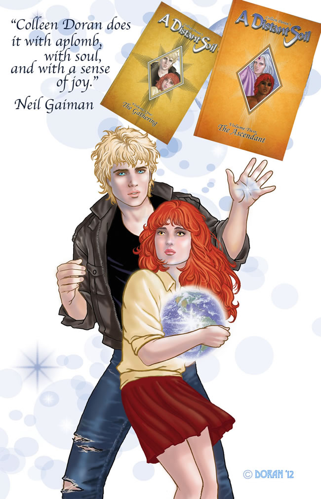
- Sincere apologies to Colleen Doran
- "…scans all the art in greyscale and does all his touch-ups in greyscale…and THEN convert to bitmap." Is Allan's A DISTANT SOIL method a THIRD computer church? Or an ecumenical missing link between George and Sean's computer churches?
- CEREBUS ARCHIVE NUMBER ONE on Kickstarter exceeds pledge expectations
- Next goal after paying off Imprimerie Lebonfon debt: scanning at 2400 dpi or HIGHER?
- Shout out to Menachem Luchins of ESCAPE POD COMICS who is working on getting a small group of comics retailers involved with our Kickstarter campaigns to help get CEREBUS and HIGH SOCIETY back into the stores.
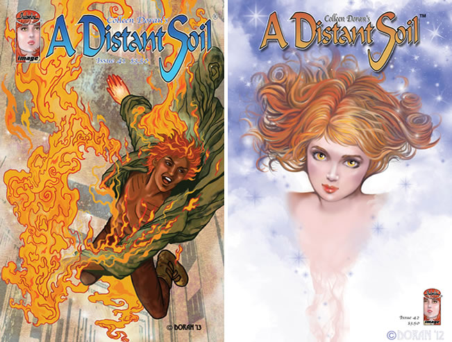
1. Sincere apologies to Colleen Doran for misrepresenting her situation in this space last week.
Indeed, the last that I knew of it was close to twenty years ago when she was "co-publishing" (the term she used at the time) under (I assumed, I guess, mistakenly) her own Aria Press imprint in tandem with Erik Larsen's studio.
(which, it turns out, isn't an accurate term -- I've just been through Erik's entire section of IMAGE: THE ROAD TO INDEPENDENCE and he says he didn't have a studio. He was just Erik Larsen, Image partner, as opposed to Jim Lee/Wildstorm, Marc Silvestri/Top Cow, Jim Valentino/Shadowline etc. I had completely forgotten that distinction and was bothered that I couldn't remember what the name of Erik's studio was: thinking I was just having another "senior's moment". "As soon as I see it, I'll go, 'Oh, right. That's the name of Erik's studio. Duh.'")
I was only vaguely aware of Jim Valentino's tenure as the publisher of Image Central and knew that Erik Larsen took over that role from him (and only knew that because Erik briefly expressed interest to me in publishing a CEREBUS COLOUR VOLUME as part of his "new broom sweeps clean" wish list) but had -- and have -- no idea how it all worked in a legalistic "on paper" sense.
The impression that I had was that titles published by Erik -- which the other Image partners didn't vote on accepting -- were (how would I put this?) "legally/on paper tangential" to Image and that -- way back when, anyway -- there was a definite difference between that and being "published by Image" (meaning, at the time, what was then called or was about to be called Image Central).
My impression was that Collen Doran/Aria Press was co-publishing with Erik Larsen in the same way that many Indy record labels were associated with major labels -- while retaining a separate identity -- and that that situation was different from, say, Jeff Smith "going to Image" where Jeff Smith "took BONE to Image" -- in the same way that Sergio Aragones "took GROO to Image" just before Jeff did -- that is, AS Jeff Smith, BONE creator, not as Jeff Smith/Cartoon Books co-publishing which remained a separate entity. Cartoon Books published BONE and then Image published BONE and then Cartoon Books published BONE again when Jeff Smith "left Image".
My impression (and, again, it's an outsider's impression) was that saying Collen Doran "took A DISTANT SOIL to Image" would have been misrepresenting the facts and have been deprecatory of what I inferred was Colleen's independent stature throughout her history with Image.
Would it have been more accurate to say that Colleen Doran and Erik Larsen co-published A DISTANT SOIL under the Image logo?
A DISTANT SOIL is published by Image Comics. Period. Full stop. Got it.
Anyway, no offence intended and sincere apologies for any misrepresentation of the facts in the matter. I'm sure the most important thing is that Colleen's enduring relationship with Image Comics speaks very well of both since they both seem very satisfied with the situation at which they have arrived whatever the legalistic nature of that relationship might be…and which is none of our business.
Okay, I have now been writing this since 1 am (caffeine-powered non-fasting day and it's now 10:30 am) I'm back from the post office and I have Colleen's books, the earlier printings from the late 90s and the current printings from this year (and Colleen is now associated with Jim Valentino's Shadowline Studio and at one point she refers to him as "her boss". So sincere apologies for not knowing THAT fact when I wrote all of the above).
I've spent the last hour going through the two Volume I's page by page and comparing, as I did with Eddie Campbell's book. First I went through the new Volume I and, yes, there are moires but you really have to know how subtle a moire can be to see them.
If the "proofs" I got from Lebonfon could be described as being around 75% accurate in this particular area -- the moires are noticeable but you have to know what you're looking AT and FOR to see them, which is why I let them go at the "proofing" stage (benefit of the doubt: I don't think the average reader will see them and I can live with them at 75%, a percentage which dropped to around 50% in the unbound printed copies and moved into the "EVERYONE will see these" category) -- I would say that these never drop much below 95% when viewed directly and never below 90% in my peripheral vision (which is one of those quirks about moires -- they're like wood nymphs or something when you aren't looking directly at them). Which is a VERY impressive percentage. VERY.
There are what I assume are creative decisions that have been made. Just eyeballing the tones, one of Colleen's idiosyncrasies was to use basically two tones and to use them as spot tones (which I think she did very effectively: it's a very distinctive look, having a craft-tint quality to it in one way but not really because it's spotted in, not "wall to wall" as, say, Roy Crane used it).
Could be 20% and 40% but it could also be 30% and 40%. I'm guessing that what she Saw in her mind's eye was closer to 30% and 35% but 35% wasn't an option at the time. They're also quite fine tones, at LEAST equivalent to the LT 24 we used on tiny Cerebus figures which is REALLY asking for trouble when you get into those fine densities with a 40%. You're going to lose some detail in the line work under the tone just because of the darkness of the tone and that happens reasonably often but not as often as I would have expected -- and I was looking for it.
So there IS a Frankenstein quality of "adjusted frequencies". To my eye -- as happened with Eddie's book -- the visual balance of the page shifts.
Is it wrong?
Well, no, not if Colleen likes it and thinks it makes the page better. In viewing my own work, that's one of the first things I would notice and have noticed about a restored page -- the balance is different. You can SEE more but it's not the page as I drew it. Is it a deal breaker? Well, no, I did approve the original "proofs" which had been Frankensteined. But I did think, "It just looks weird." The first impression is: "Okay. Weird." I can keep looking at it and get over that to a degree but it's the same as making a first impression on a person. You only have that one try.
My honest reaction is: maybe in the 22nd century we'll have "gotten over ourselves" in these areas and have figured out a way to do photographic reproduction again where you don't have to "Frankenstein something".
OR
we'll have gotten to the point where a tech person will know, Oh, okay, I know what Dave is saying. Most people don't worry about that or even notice it. You lose SOME detail but it's just this extra keystroke: Restore Balance. It'll be tuned to the same macro-micro adjustment our eyes make going from an overall impression and then zooming in. "If that's how you view artwork by your Comic Art Metaphysics nature: macro first and then only micro when you've taken in the whole thing at a glance, then this is how you will see Balance and what you'll want to adjust on this sliding scale of Macro/Micro ratios."
Like taking a quiz in COSMO or something.
And I would probably still ping-pong between the two. I want all the line work back, now the balance is off, I want all the line work back, now the balance is off.
There are weird politically correct questions (in which, obviously, I'm not interested but which is of PROFOUND interest to the Zero Tolerance People among us) about whether you've effectively changed someone's race if they were previously a "40% race" and are now a "35% race" which (like ALL of those questions you could chase down a rabbit hole and never come out the other end). Is it racist to say that the line work on the face of someone who is a "40% race" is obscured by the colour of the person's skin and therefore it's not only permissible but mandatory to "lighten" their skin digitally?
Again, I think that's Colleen's call to make: it's her line work and her mental image of the artwork. If she pictured it as 35% or came to the conclusion that it would be better at 35% than at 40%, the creative decision supersedes the racial sensitivity.
But, I don't think we're going in that direction as a society. I wish we WERE, but I don't see any evidence of it.
There's also some amazing work in changing the coarseness of a tone -- the dots are bigger on some areas of 40% tone where Colleen has used a sheet of tone that's down around 30 dots per inch instead of 40 dots per inch -- only a handful in the entire volume but VERY noticeable when you're comparing them head-to-head (HERE! What happened with this area? And quickly looking back and forth from the one to the other) -- so, in addition to taking it down to 35%, the restoration guy, Allan Harvey, has made it the same density as the other tones on the rest of the pages without losing the line work detail under the tone. HOW do you DO that? I'm guessing micro inch by micro inch over the course of HOURS. Or maybe it's a simple trick. But I'm guessing a LOT of digital babysitting. Which is why I would say that Colleen is definitely getting her money's worth WHATEVER she's paying him. Can't see it on CEREBUS. If it was JUST CEREBUS and HIGH SOCIETY, yeah, sure. Bite the bullet, borrow against the life insurance and just Get It Done. But CEREBUS and HIGH SOCIETY are literally just the beginning.
2. Sincere apologies to George and Sean and "mille pardons" to Lebonfon, as well. With the volume of work required to get the CEREBUS ARCHIVE NUMBER ONE Kickstarter campaign up and running I've not had a chance to read any of the reactions to the last couple of Weekly Updates which I will be doing today as soon as I post this. Although I'm going to have to cap this at some point because I'm WAY, WAY, WAY past the two hours a week I can allocate to it. Roughly twelve hours past and still counting.
I even had my photocopier salesman come back to ask some more questions. I just want to get an 11x17 scanner, photocopier and fax machine...
(which isn't going to happen and which I figured but you might as well ask: there is no way to keep the office from being like everyone else's office: overrun with computer cords and equipment) (Bill was the salesman on the photocopier I have now, from 1995. He brought over the original contract signed by Gerhard. I officially have the oldest photocopier by a good ten years compared to anything else INS sells leases or services)
…but anyone who knows anything about printing and many people who don't just get FASCINATED by this guy with the 6,000-Page Problem. I mean, it was -- IS -- nice of him but it was another half-hour conversation of "Uh, no, we already thought of that. That toddles along the garden path and then the 'fork in the road' turns out to be "these two possibilities" and that's what we don't have an answer to.
He knows of a local company that converted all of their negatives to digital files but, you know, "That was probably 10 years ago. I don't even know if they still have the equipment. Why would they hang onto it?" They probably didn't. Did I mention I still have to answer the rest of my mail and pay bills and try to figure out how to make some revenue from art auctions sometime in the next few months because I haven't got nickel one coming in right now? Trying not to, you know, PUT it that way.
Okay this next part was written between 1 am and 7 am when I left to get the mail and buy groceries:
I AM interested in what both George and Sean have to say about Colleen's relaying of Allan Harvey's reproduction solutions as it applies to their CEREBUS restorations:
(Since this will conclude the Colleen portion of our program, let me say how nice it was to get autographed copies of the books -- one PERSONALIZED! And autographed prints in the Volume 2 package. And how amazing -- uh, no -- AMAZING it was that I had been added to the list of people thanked on the new printing of Volume I. I checked it three times. "I must have just dreamt that." No, there it is. And it's the NEW printing. Couldn't have been more surprised in today's political climate: which for all intents and purposes is the same as the political climate 20 years ago if you're Dave Sim. I can't say it makes up for the times that I've gotten stuff from people who have said that I'm a HUGE influence on them but I'm distinctly NOT on the thank you list in their books, but…as I say, couldn't have been more surprised. Anyway Colleen e-mailed Eddie Khanna:)
Allan scans all the art in greyscale and does all his touch-ups in greyscale. This was such an important difference from the previous guy who scanned (and taught me to scan) as bitmaps. REALLY bad move. Scan at greyscale, do corrections at greyscale. Place the art on your template for printing and THEN convert to bitmap. My friend Val Trulinger made our digital templates, and we just place them on the blue-lined guides and upload the finals. All art should always be scanned and archived at greyscale, as well as archived in final bitmap form.
Most of my original art is done very small: slightly larger than manga publishing standards. But my early art was done larger than standard American comic size.
(this was why I focussed on Volume I when it came in. To paraphrase Biggy Small: Mo' reduction, Mo' problems)
This is where you're going to have moire troubles, because fine tones will close up more when shrunk down from the larger-sized art. We had some minor moire tones on some backgrounds on early art: maybe about a dozen panels or so. Not worth getting upset over considering it's a 250-page book.
On later pages drawn at the smaller size, I saw no moire tones at all. While Volume I had about a dozen panels with some minor moire in the background, I didn't find any moire in Volume II, and that is largely because of the size of my original art and use of Japanese tone sheets.
We scan at 1200 dpi greyscale, and then convert to bitmap at 50% threshold. There are a few pages I ran as diffusion dither to retain some grey tone digital effects. We got good results on those as well. I scan art I have here and send it to Allan in London via FTP site. He uploads finished, camera-ready pages after completion and then Image compiles the book. The editor and I go over them and make necessary changes, though there were very few on Volume II, especially. We learned a lot from Volume I and since the art gets cleaner as we go, it's easier to handle.
There are a few differences that I see (and I hope George and/or Sean will correct me if I'm digitally off-base here):
a) CEREBUS and HIGH SOCIETY are each 500 pages and, between them, represent only one sixth of the Total Project that we're looking at: 6,000 pages. This shouldn't be overlooked, I don't think. Which is why I don't want to go charging off in any particular direction until I KNOW where we're going. But, as happened with the unbound printed copies, at some point you have to go charging off somewhere…but try to keep it down to costing you $2,000 instead of $10,000 if you can manage it. And try to keep from having too many "Dave Sim's Really Cool Oops No, Turns Out 'Just Expensive' $2,000 Adventures!" in any given year.
b) the moire problem isn't confined to the backgrounds since the 30% tone on Cerebus is a central fact of the lead character. Anywhere you get even a slight moire, you get a "plaid" lead character. On even a dozen panels, it's going to take the reader out of the book anywhere that it occurs, something that isn't likely to happen where it's only part of a tone effect or background as is the case on A DISTANT SOIL. (After actually looking at the ADS books: this isn't true of Allan Harvey's restoration. There are at least two characters where the tone on their skin is central to their identification and any flaws -- if they existed, which they don't -- would jump out at you BOO!)
c) all of the pages are 11x17 and the lines get finer and finer as Gerhard and I (in our own minds) try to "keep up" with each other and end up, instead, getting successively microscopic in our rendering, something an upright camera, flood lighting, photographic negative and direct-to-metal-plate transference can capture and which (at least so far) seems to be beyond the ability of computer greyscale and bitmapping to match at the printing stage and which it is only able to approximate in the proof -- or, rather, "proof" stage. (I'm reminded of the fan who wrote to me about how STOP MAKING SENSE, the Talking Heads album, sounded like it was recorded inside of an oil drum when digitized -- you take my point, sir! --and that David Byrne had to make a stink about it to get it fixed -- I'd imagine what David Byrne thought "fixed" sounded like is probably not want Tina Weymouth would think "fixed" sounded like. I think it's "built in" with a computer based society in most creative areas. I realize I'm alone in that, pretty much, and what else is new?)(Again, I'd have to say that that doesn't seem to be a problem with Allan Harvey's restorations on A DISTANT SOIL)
d) GOING HOME is rendered almost completely in microscopic mechanical tones which means virtually the entire book will be as much of a headache as the really tiny LT 24 dot tone on the smallest Cerebus figures in CEREBUS and HIGH SOCIETY is proving to be. (could be, could not be. GOING HOME may not be an actual problem in my lifetime just because I'm not going to live for another fifty or sixty years -- I don't think) (and I'll reiterate that the tones Colleen was using way back when were generally up around -- if not above -- the 42.5 dots per inch density of LT 24 AND many of them 40%)(although not retained AS 40%: was that a "no can do" call on Mr. Harvey's part? "I can keep it 40% but I won't be able to bring up the ink lines on the face under the tone. If it's okay to take it down to 35% I can clean the tone AND have sharp clear lines under there.")
GOOD news this week:
3. On the Kickstarter campaign itself:
Doing the basic math -- 70% profit margin (so, divide the pledged amount by 10 and multiply the result by 7, subtracting the shipping fees which are included in the pledges but aren't actually part of the profits) -- If the number of reservations hold through May 31st we are looking at being closer to paying HALF of the outstanding amount to Lebonfon as opposed to my original projection of between a third and a quarter. One potential caveat on that, we had a woman cancel her pledge without explanation, which I suspect might be a This Is What All Good and Decent People SHOULD Be Doing To Dave Sim the Evil Misogynist kind of a gig. And we have about sixty people who reserved numbers but haven't officially pledged so the situation is -- as they say -- potentially fluid.
But it, right now, it is good news and many thanks to the -- considerably MORE than The Last Ten -- CEREBUS Customers who are making that possible this month!
Instead of taking a year or more to get Lebonfon paid off, I should be able to do that by the end of the Kickstarter campaign for CEREBUS ARCHIVE NUMBER TWO this summer. Or NUMBER THREE if the pledges "nosedive" after NUMBER ONE.
Which leads into "what happens after that?"
4. a) The sample signature that we've been discussing for the last while, hopefully. Bearing in mind that I want all of the outstanding debt with Lebonfon to be paid off before proceeding.
The problem I see is that I don't want to get into an implied legal relationship by authorizing the sample signature before paying the "printing bills to date on CEREBUS and HIGH SOCIETY". I don't want any LEGAL inference that Lebonfon is still the CEREBUS printer and that I HAVE to pay them the full $20,000 and another $14,000 to finish both books because I've been working with them for the last seven years.
I want to be in a situation where I can get a sample signature done by Lebonfon without there being an inferred commitment to go ahead and print the books so, if the signature isn't SUBSTANTIALLY better than the unbound copies from the first round -- 30 to 40% better being a conservative estimate -- I'm then at liberty to go to another printer with Lebonfon's sample signature, the digital files and ask, "Can you do a better printing job than this from these files?" and then authorize the other printer to do a sample signature after getting a price quote for their printing.
And then be able to walk away from that situation if their printing isn't any better.
I'd have to say that I prefer Colleen's paper choice over Eddie's -- which is just personal preference, nothing against Eddie -- but I have no idea how expensive it would be or what 500 pages of it would look like. The paper is glossier but thinner, evidently, because the books are noticeably thinner while having the same page count. As Colleen points out, Image is an 800 lb. gorilla in terms of printing volume so they're going to get a better price. THEORETICALLY I have SOME clout, but only theoretically. "Margaret and nine other people" as a fan base and "Menachem Luchins and Stephen Holland and…well, surely, SOME other retailers" as conduits!"
That remains to be seen.
And don't call me Shirley. Nyuck nyuck nyuck.
Which leads to the second step and the reason that I haven't taken it yet:
b) it's very possible that it's ALL or MOSTLY a scanning/dots per inch problem.
Period.
Because of the fineness of the detail in the Cerebus art, coupled with the microscopic 30% tone problem the original art, where it is available, and the negatives where they are available need to be scanned at a much higher resolution.
I bought a replacement for the photographic film scanner that Sandeep was using when his home was destroyed in the tragic fire of August 2012. Right now John Funk has it. It's basically been a $700 paperweight at Graphic Edge Print Solutions for about a year now. Except for the day that one of his customers said, "I know that machine! Hey, you know what you can do? Pour oil on the glass and you get a completely tight seal!" I'm thinking…no.
I asked John the other day, "How high a resolution does the scanner go to?"
He answered, "Ridiculously high." Explaining that one of the things it's intended for is scanning slides -- which are an extreme example of what we're looking at. Slides are very, very, very small but people want the scans, in many cases, to be capable of being enlarged to, say, billboard size with no loss of detail.
For that you need "ridiculously high" resolution options. WAY above 1200 dpi which is already "high end" for scanning virtually all comic-book art.
The problem is the scanning time. John timed how long it took to scan a typical Cerebus negative at 1200 dpi and it was about 15 minutes. So, at 2400 dpi it's going to take 30 minutes. And if we go with higher resolution, you just do the math. 40 minutes? 50 minutes? (my photocopier salesman reminded me that the length of time is squared, not doubled so going from 1200 dpi to 2400 dpi -- well, hey, thanks for brightening my day. Did I mention I've been up and writing about this stuff since 1 am?)
The POTENTIAL advantage is that you diminish your reproduction problems. The longer the scan time, the more detail the scanner is going to pick up and the cleaner it's going to reproduce. Even the smallest 30% tone dots on Cerebus are going to reproduce AS dots -- not pixilated blobs. Theoretically, anyway.
The major disadvantage is, again, do the math. 3,800 original pages and 1,200 negatives times 40 minutes each? 50 minutes each?
John reminded me that we had gotten this far in the discussion before. Coming from an engineering background he said PART of the answer was multiple scanners. I think the scanner cost around $700. He said, even though it looks like an enormous outlay to buy, say, five of them -- $3,500 -- if you have five of them lined up and one person loading them in sequence and hitting "scan" and then taking the negative out and storing it after it's been scanned then you could probably be scanning them at 40 minutes each but actually only taking eight minutes once the person doing the scanning had built up a rhythm and each scanner is at a different stage in the scanning process.
You still need to pay that person and WHO that person is is limited by my EXTREME reluctance -- since Sandeep's fire -- to let the negatives out of the house overnight under any circumstances. John's pretty much elected unless I convert the office into a photographic scanner assembly line and then listen to that racket for months if not years on end.
(And probably get a visit from Ontario Hydro and the Ontario Provincial Police because the only thing that would account for using that amount of "juice" in a house this size is a "grow-op")
And whether you're paying per scan or per hour, this is definitely going to require some VERY successful Kickstarter campaigns for years to come.
We will do what we can based on how much money has come in/will come in.
And we have to be sure of the answer, which is why the interim "next step" in this end of things is to take one negative and scan it at 1200 dpi, 2400 dpi, 3200 dpi and so on and then download the files (after they've sapped a lot of the electrical energy in downtown Kitchener being produced) to Sean and George and say, Okay, at what point do the problems disappear?
Or DO the problems disappear? If the digital files ALWAYS need tweaking then where is the sensible break? Do the problems diminish enough at 1200 dpi that 2400 dpi is overkill? Do enough of them disappear at 3200 dpi to create an enormous pre-press time saving (i.e. Zero Tweaking Needed?)
Sean came down on the side of the "anything over 1200 is overkill" view until he had time to think about it and then -- after consulting with a co-worker -- admitted that 2400 dpi digital files are not unheard of depending on a) what you are trying to accomplish, b) how accurate you're trying to be and c) what your raw materials are. To save you checking the back of your textbooks, the answers are a) accurate reproduction b) very and c) not very good.
So, it's not as if 3200 dpi is "off the table". It SOUNDS like overkill until you show someone exactly how tiny the dots on a sheet of LT 24 tone are and how small they get when the page has been reduced to 57% (standard for ALL Cerebus pages).
It's POSSIBLY the same thing (in a way) as what Dave Fisher was taught about recorded sound. You can FIX sound but the better option is always more accurately recorded sound. 2400 dpi or 3200 dpi might constitute analogous
"more accurately recorded sound" in a visual sense. But we won't know that until we look at what "ridiculously high" resolution does and see what it fixes if it even fixes anything.
Anyway: there you have "YOUR Kickstarter Dollars In Action". It's not very sexy, but that's where most of the money is going to be going in CEREBUS Restoration for the foreseeable future: multiple scanners and paying someone enough to allow their brains to be turned into cream cheese feeding the beasts for hours and hours on end.
5. Finally, a shout-out to Menachem Luchins of ESCAPE POD COMICS who, so far as I know, is the only retailer who regularly reads these Updates and has volunteered to try to get other Dave-friendly (or, perhaps, Dave Less-Antagonistic retailers) involved in helping finance the Kickstarter campaigns.
Menachem estimates he could have sold at least 20 copies of CEREBUS and HIGH SOCIETY just in the time his store has been open (a couple of years) and that this isn't unusual in comics retail right now.
(just an anecdote, but someone left a phone message saying that even Amazon is selling used copies of the first two trades for $40 each. I'm sure Amazon has a computer algorithm that tells them what to price books at based on availability)
Unfortunately, since we're not exactly a comics retailer destination there's an impression that CEREBUS and HIGH SOCIETY will just turn up on the Star System again any day now -- when the fact of the matter is that the timeline is very uncertain and probably measured in YEARS depending ENTIRELY on how the Kickstarter campaigns go. We won't even be back to the sample signature stage until the end of the summer at the earliest and, as I've outlined, the sample signature stage is only the beginning.
I'd say this is getting ridiculous, but in a real sense, this was already beyond ridiculous months ago when I started doing these weekly updates. So how about this Really Cheesy Way To Try To Drum Up Some PATREON Business (PATREON who still hasn't paid me, not that there's anything wrong with that: don't want to be Dave Sim the Troublemaker)
STRANGE DEATH OF ALEX RAYMOND UPDATE: Hello Patreon supporters! As I said last time, you should be getting full-sized Artist Editions of SDOAR #4 before the end of the year. That's TENTATIVE in the sense that IDW is a BIG company with a SMALL staff but Ted and I are definitely "on the same page". My next question to him is going to be: Okay #1 to #4 is one book. I'm uploading 10 pages a month to you on average of #5 -- the issue that never ends -- so, you tell me AS a publisher. When do you see a natural break for the second book?
One of the things we -- very amiably -- disagree about is promotion. Along the lines of his target to get on the New York Times bestseller list, he's recommending readings and signings at major bookstores. WAY down the road, but, Ted has a very firm idea of How That Will Go. You know: the major store orders 200 copies of the first volume and they get me for a reading.
I hear that and what I picture is me, 200 books and a line consisting of one guy with a copy of TEENAGE MUTANT NINJA TURTLES No. 8 and another guy with a copy of SPAWN 10 with that "can I just get these signed and get OUT of here BEFORE the reading?" looks on their faces.
Not to mention the "we don't have anywhere close to 2,000 signatures on the "I Don't Believe Dave Sim is a Misoygnist petition" and at the rate of 500 signatures every five years, we won't have until 2029 at the earliest. Ted's pretty sure he can help with that. Which I'm getting used to. Dave Sim the madly adored graphic novelist with thousands and thousands of clamouring fans "We Want DAVE! We...